|
Currently 1790 logos in db. |
|
|
|
|
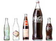
The Coca-Cola Design Case
|
|
|
|
Logo of the Day - Milky Way
World's finest selection of logosgoodlogo!com is dedicated to the artform of the logotype and its accompanied corporate identity.
We hope to serve you here with the finest selection of logos, selected and submitted by everyone
from all over the world. With our voting and rating system and our classification in categories we
would like to give you a multidimensional view on the best logos for different purposes. We accomplish
this by letting you select different categories and styles per top-listing. Please feel free to try!
In our extended info pages of logos you can also see these classifications. But that's not all! You can also
find info on by whom a specific logo was designed, where it's from, some trivia and of course our statistics generated
by our visitors.
With our design cases we like to give you an insight on how a good corporate identity is remained through
time via minor corrections on the logo. Over a longer time-span resulting in a seemingly natural evolution
of the logo, whereby, in case of a good redesign-job, the logo will remain its characteristics and all
of its style elements.
You can also check out some of our articles in the background info section on the site. Here you will find
articles on what makes a 'good' logo; what colors are best to be used, should a logo be really simple or are there
any hidden values in logo design? You can all find out, just click here!
Or if you are just looking for a logo? Just type its name in our search box available on top of every
page throughout our site.
In the era of multimedia like television and internet and the ever smaller getting competitive
gap between companies, image is everything. On the internet for instance a company is almost
completely presented by graphics and texts. No longer not only the performance of a product
or service is the most important thing. The Look & Feel and the image of using and being seen with this
product or service is just as important. For this and for some people a lot more reasons, the
logo of a company and its overall branding is very much important.
By buying for example a car you're not just buying the car and its performance and luxurious
interior, you also buy yourself an image created by good branding of marketeers and of course designers.
These days a company without clear and clean branding won't last as long as it did posess these elements.
Finally we apologize for the small number of logos currently in our database. But of course you can help by
submitting us your alltime favorite logo or logos.
|  |
|

|


 - login